News & Insights

Jamie Sergeant
Global CEO

We look at what makes a good landing page and how some detailed thinking up front can pay dividends later.
In many cases your website still acts as the destination for your digital marketing activity. Compared to other channels, it is still the best channel online where you have the freedom to get your message across without constraint. You aren’t limited by word counts, image choice or size and can create an engaging environment where your customers can discover more about you and take the next step. Whether this is a purchase, a contact request or an app download.
Our clients allocate budgets to ensure their digital 'market stall' is operating at 100%. Crowd undertake strategic content marketing, SEO, mobile optimisation, usability testing and other techniques to ensure that potential customers can find our clients online and achieve their personal goals easily.
We can speed the process between seeing our ad or post and achieving our goal through the use of a highly optimised landing page.
A landing page allows us to speak to a warm lead (assuming they were interested in the content of the ad) give them enough information on their interest and then provide the call to action (CTA) in as short a timeframe as possible. Making it convenient for the customer and maximising results for the client.
Why not just make a website full of landing pages?
Whilst Crowd will always recommend providing clear calls to action on every page, the website is speaking to a customer on a different journey. They may be browsing or researching the product or service in order to make a comparison with a competitor. The website needs to provide more in-depth and compartmentalised information on the service or product and more detail on the company. It needs to be less ‘pushy’ and allow our visitor to explore at their leisure.
If a customer has engaged with an ad or social post, it is safe to assume that they are on a more advanced journey - especially if it were a retargeting ad. They have seen a product or message that directly appeals to them amongst the noise of competing ads and has distracted them away from their current task which in all likelihood was unrelated.
The landing page allows us to reflect the messaging of the advert and provide a summarised and targeted version of the information needed. Landing page content should also reflect the targeting of the ad itself: addressing the demographic directly and addressing their specific requirements.
This obviously requires careful planning and coordination.

So what should we include on our landing page?
It is essential to maintain the company branding and look and feel to provide reassurance to visitors that they are at the right place. The design should also feature imagery cues from the ads, social posts or mailer designs to similarly provide visual continuity. Veering too far from standard will cause the visitor to wonder whether they have arrived at the right place and anything that may cause anxiety on the part of the the visitor should be removed.
In general the regular site navigation should be excluded so that distractions are minimised, however as we shall see, in some circumstances this rule can be be bent.
Generally text on the page should be punchy and minimal and should be entirely focussed on providing just enough information for the visitor to make an informed decision on taking the next step. If there is too much information then you may need to consider either creating separate landing pages or perhaps just sending visitors to the website.
The text should be accompanied by clear USPs and benefits of the product or service. Broken down into punchy bullet points or statements. In preparing this content, as always it’s important to put yourself in the place of the customer. It’s also essential to ask the client what questions do customers usually ask when speaking directly. Search terms from the analytics package may also guide you here. Make sure typical customer objections are addressed.
The call to action will vary depending on the products and services on offer. It may be a form to find out more information, an add to basket link or even a phone number dependant on the client’s needs and processes.
As always calls to action should be clearly signposted giving the customer a clear idea of what the next step is and what clicking or pressing the button will achieve.
Tracking should be applied to the landing page, for the call to action and any other links that may appear on it. These should be at a minimum, but if there is any drop off, any clues as to where the visitors went is going to inform future campaigns and optimisations.
Landing page examples
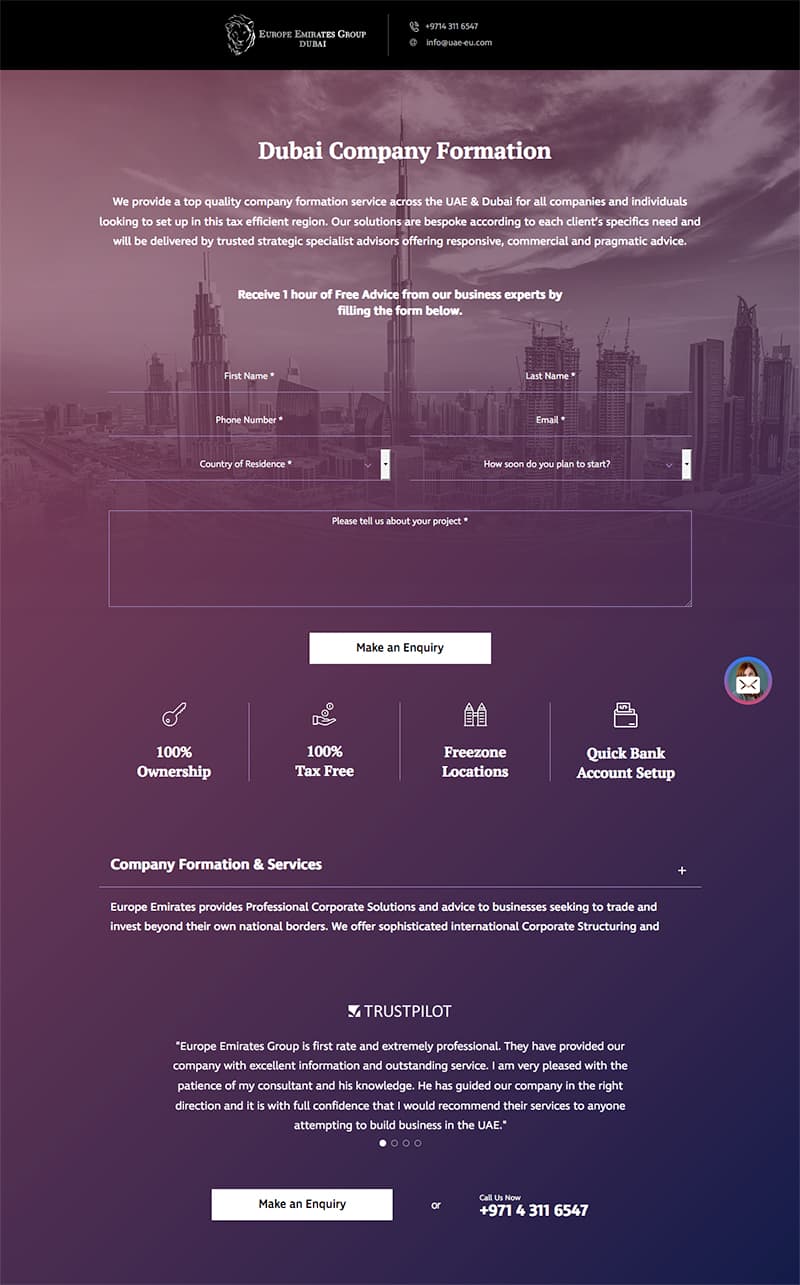
For other clients such as Europe Emirates Group we kept the landing page short and to the point. Highlights, benefits and trust signals are all clearly shown at a glance with the contact form shown in prime position.
Other distractions such as the main site navigation have been removed, although branding and design are very closely linked to the main site and advertising collateral.
https://uae-eu.com/lp/dubai-company-formation/
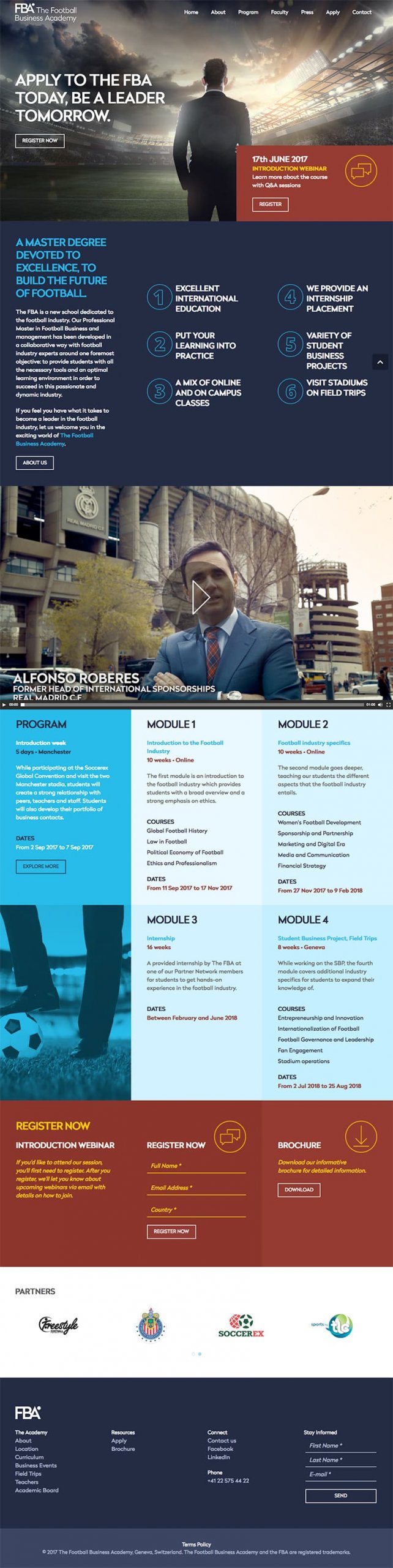
In this example for one of our clients (The Football Business Academy) we needed to include more information due to the product being complex and expensive. Rather than try to coax a purchase of tens of thousands of pounds for a degree course, we recommended changing the call to action to be a webinar registration. It is highly unlikely that a purchase of this magnitude will be made based on a banner ad and a landing page.
Content is short and bullet pointed and provides enough detail for the customer to get a good understanding of the proposition.
By softening the call to action and adding the extra step into the purchase journey we are qualifying potential customers and putting them in touch with the client. As everyone hitting the landing page will be arriving having seen banner ads or social posts, we needed to sell the complex benefits and outcomes of the course.
The webinar also serves to capture those really interested parties. If they are prepared to take time to participate, then we can assume they have considered the proposition and the cost is no longer a barrier.
We have retained site furniture such as the navigation and footer to give visitors a means to do more research if required. This is as a result of the nature of the product.
Conclusion
In this article, we have looked at what constitutes a great landing page and some of the things to consider when creating one. As you have seen it’s an involved process and it’s essential to maintain that holistic view of the process when making decisions on your campaign landing page. We have also seen that the guidelines are flexible depending on the products or services on offer.
Crowd believe that landing pages constitute a vital part of your digital marketing efforts. With offices around the world, why not get in touch and our global digital marketing agency would be happy to talk to you about how we can meet and surpass your marketing goals.